Catfish | Restaurant Design
Bern, Switzerland / 2015

“A special project to me, as it was my first Interior Design project, while I was still active in branding and design management. My initial scribbles, and passionate ideas convinced the developer to let me take over the creative lead for this 33-seats and take-away hospitality sushi-restaurant. Almost a decade later, I benefit from learnings and appreciate to observe how socio-cultural and interior trends can be manifested in spatial design. Amazing to see that a long (belt) table gets new meaning today when it comes to spatial design that fosters community and inclusivity. Even so, that the initially selected finishes and design classics from Alvaro Aalto pendants to Bouroullec’s Algues will hardly get out of date.”
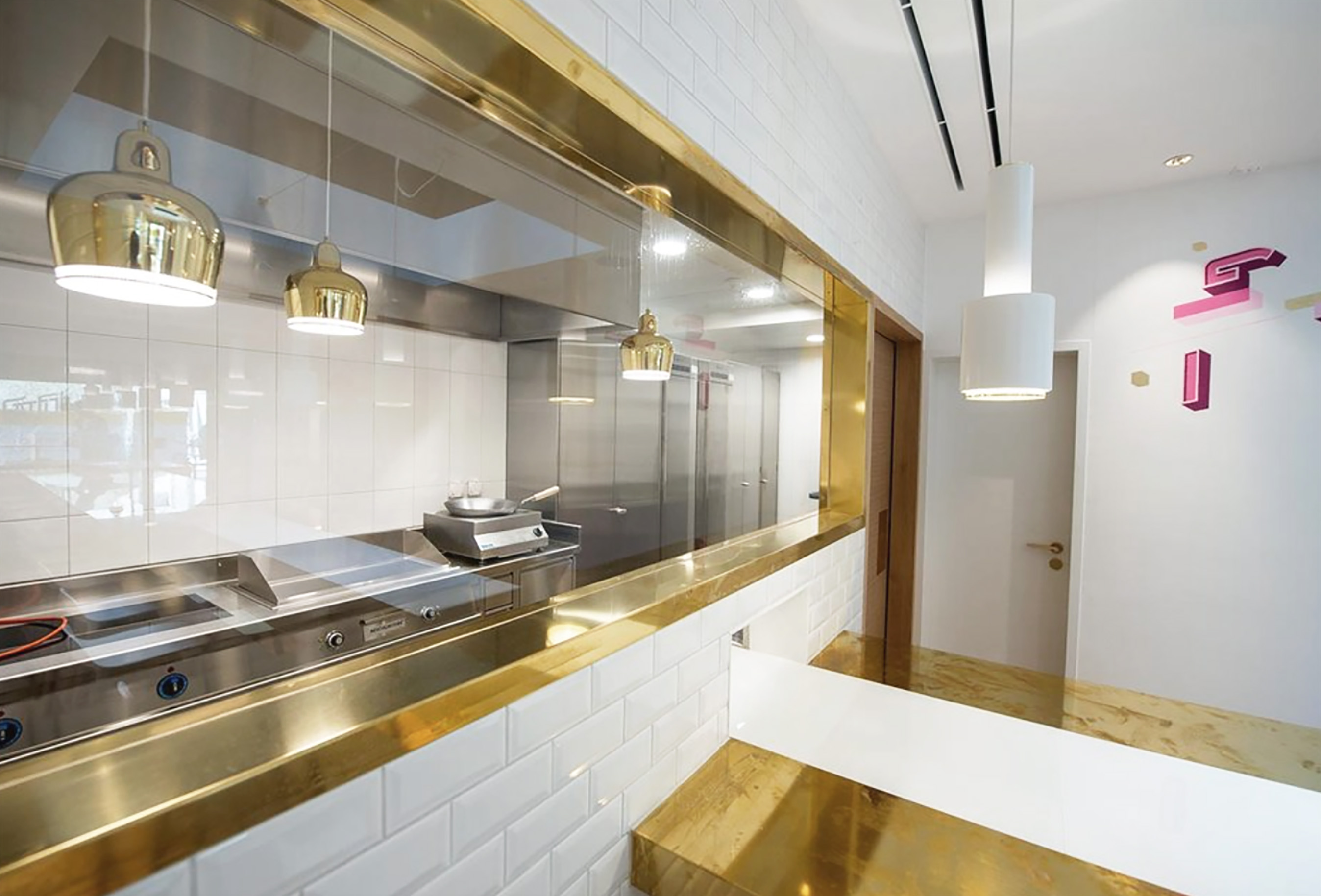
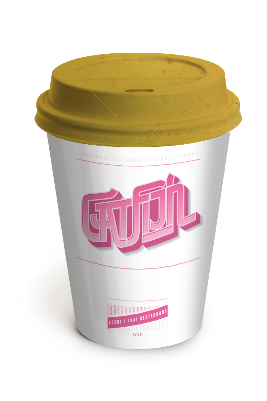
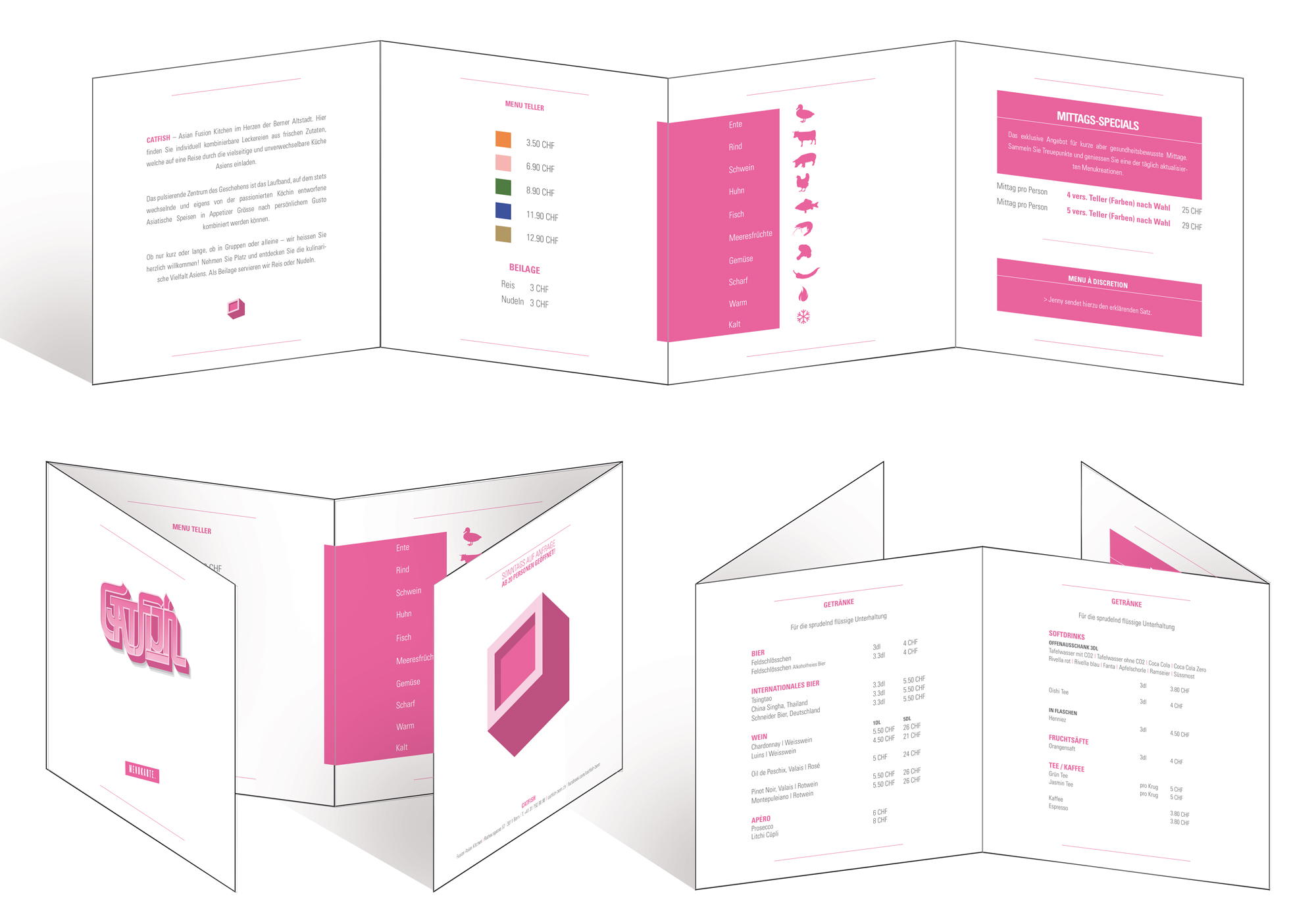
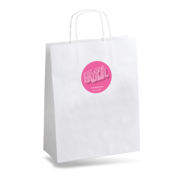
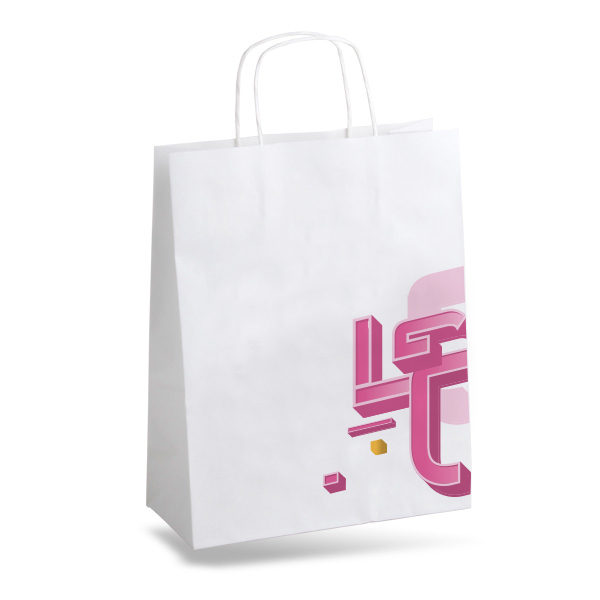
A location in the old part of Bern’s historical, grey sandstone builds. A small, deep space, inviting to integrate a sushushi-belt as an attraction (which was quite unique in Switzerland - back in 2013). The belt, paired with material-, color- and graphic style palette targeted millenials and dates. Inspirations were drawn from traditional Swiss materials (wood), blended with brass counter and finishes, while Nordic design elements found their place in pendants and chairs. The mural and graphics lent a strong brand narrative to menu, cuttlery and plates. The pink and shape of the ‘Catfish’ font was inspired by Japanese Manga culture and translated into a more European style.


Date: 2015
Spatial Design and Brand Communication: Comissioned by Glandon Apartments
Collaborators: Amanda Portmann (Designer), Pascal ‘KKADE’ Flühmann (Graphics), Achermann (Architect)
Category: Things I built | Sushi Restaurant
Location: Bern, Switzerland
Spatial Design and Brand Communication: Comissioned by Glandon Apartments
Collaborators: Amanda Portmann (Designer), Pascal ‘KKADE’ Flühmann (Graphics), Achermann (Architect)
Category: Things I built | Sushi Restaurant
Location: Bern, Switzerland